CMYK vs. Pantone (PMS) in Commercial Box Printing
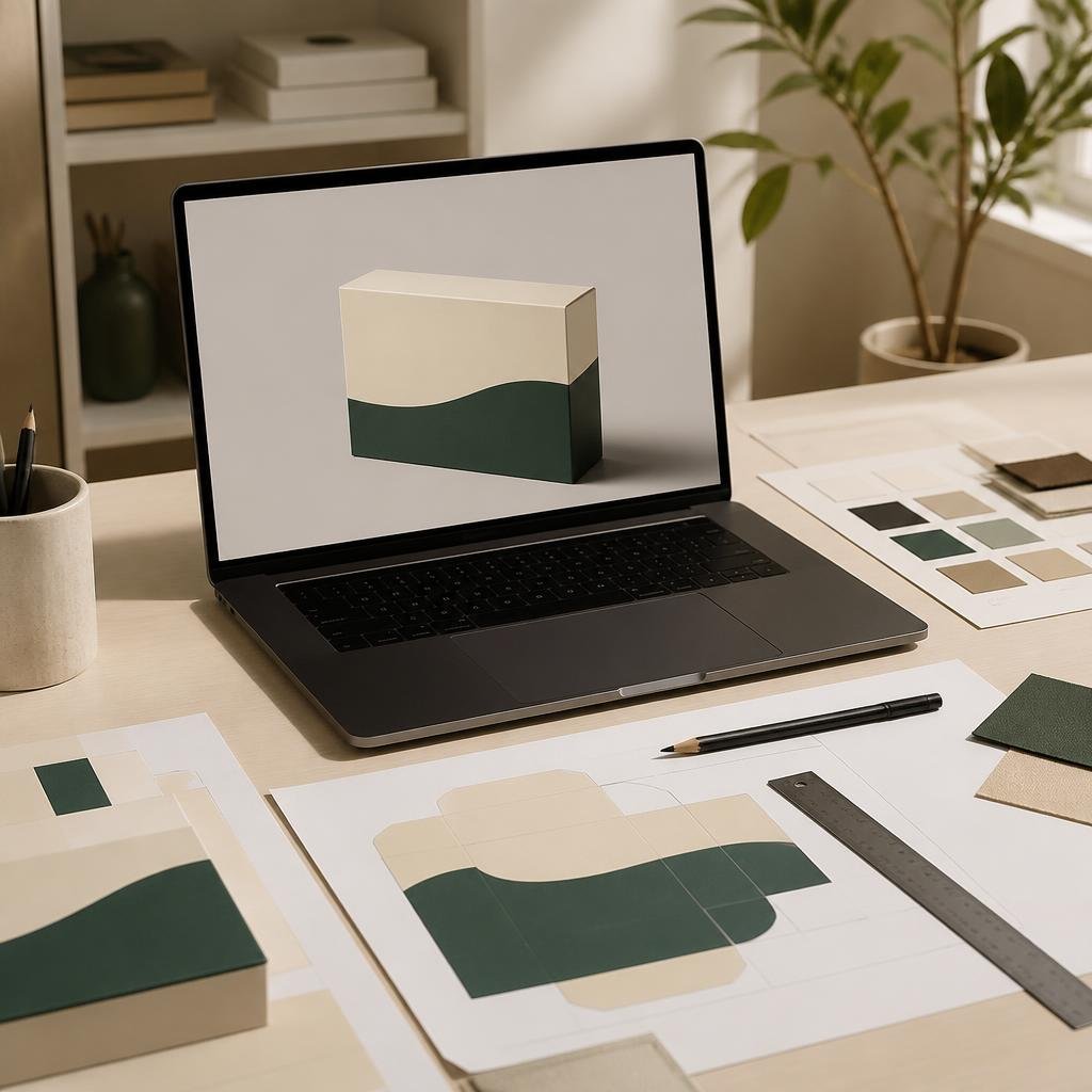
When transitioning a packaging design from a glowing computer screen to a physical, high-speed commercial printing press, the most critical decision a brand must make is choosing between the CMYK process and the Pantone Matching System (PMS). Misunderstanding these two distinct color spaces routinely results in muddy brand colors, expensive press reprints, and fractured brand identity across different packaging formats.
The CMYK Process (Four-Color Offset)
CMYK stands for Cyan, Magenta, Yellow, and Key (Black). It is a "subtractive" color model. When commercial offset presses print CMYK, they do not mix the ink in a bucket. Instead, the press lays down four separate layers of microscopic translucent ink dots on the paperboard. Your eye optically blends these overlapping dots to perceive a full-color photographic image.
The Pros of CMYK: CMYK is highly cost-effective and is the absolute global standard for printing full-color photographs, complex gradients, and multi-colored artwork on packaging. Because it only requires four printing plates, the setup costs are significantly lower.
The Cons of CMYK: CMYK has a limited "gamut" (range of achievable colors). It cannot reproduce highly vibrant neon colors, metallic sheens, or intense, saturated oranges and navy blues. Furthermore, because CMYK relies on overlapping dots, a large area of solid color printed in CMYK will often look slightly grainy or suffer from minor color shifting between different print runs based on press calibration and paper humidity.
The Pantone Matching System (PMS / Spot Colors)
The Pantone Matching System (PMS) is an entirely different approach. A Pantone color is a "Spot Color." Instead of overlapping CMYK dots on the press, the ink manufacturer mixes a precise, highly specific formula of base pigments in a physical bucket before the ink is ever loaded into the printing press.
The Pros of Pantone: Unwavering consistency. If your brand color is "Pantone 214 C" (a vibrant magenta), it will print as the exact same vibrant magenta whether you manufacture your boxes in Los Angeles, Paris, or Shenzhen. Because the ink is pre-mixed and printed as a solid flood layer, there are no overlapping dots, resulting in a perfectly smooth, rich, and dense color application. Pantone is also the only way to print specialty inks, such as metallics (e.g., Pantone 871 Gold) or fluorescent neons.
The Cons of Pantone: Cost. Every specific Pantone color requires its own dedicated printing plate and its own distinct ink station on the commercial press. If you design a box with a CMYK photograph, plus two Pantone brand colors, you are paying for a 6-color print run, significantly increasing manufacturing setup costs.
The Screen Deception (RGB to CMYK Conversion)
The most common pre-press catastrophe occurs when a designer creates packaging on an uncalibrated monitor using RGB (Red, Green, Blue) color space. RGB is an "additive" light-based color model used exclusively for digital screens. RGB can produce incredibly vibrant, glowing neons that physically do not exist in the real-world chemistry of CMYK printing ink.
If you submit an RGB file to a commercial factory, their Raster Image Processor (RIP) software will automatically forcefully convert the file to CMYK. The vibrant neon green on your screen will instantly collapse into a dull, muddy, olive-toned forest green on the physical box. To prevent this, all master packaging files must be designed strictly in the CMYK workspace from day one, utilizing certified ICC press profiles (like US Web Coated SWOP v2 or GRACoL 2006) to simulate the exact dulling effect the physical paper will have on the ink.
Strategic Application for Packaging
For high-end retail packaging—such as luxury cosmetics or pharma—brands typically utilize a hybrid approach. They print the product photography and ingredient panels using standard CMYK, and they assign 1 or 2 specific Pantone Spot Colors exclusively for their primary brand logo and solid background floods. This guarantees brand consistency while keeping costs manageable.
Topic FAQs
No. CMYK can only simulate a muddy, flat yellowish-brown gradient. True metallic reflection requires a specialized Pantone Metallic Spot Ink (like PMS 871 C) containing actual metal flakes, or a hot foil stamping die.
Computer screens emit light (RGB), making colors appear vibrant and bright. Physical paper absorbs light (CMYK). Uncoated paperboards, like raw kraft, absorb ink deeply, causing colors to appear significantly darker and less saturated than a glowing screen.
Printing a large background area using only 100% Black ink (K) often looks dull and dark grey. Pre-press engineers use 'Rich Black' (typically C:40, M:30, Y:30, K:100) by adding layers of cyan, magenta, and yellow underneath the black to create a deep, dense, saturated darkness.